Apple’s Vision Pro brings giant promises to the realm of spatial computing, but will it deliver? Accessibility is a crucial make-or-break factor for new devices, so we put it to the test. Together with Roel Van Gils, accessibility expert, we uncover both the promise and the pitfalls of this new piece of technology. Can the Vision Pro truly be the inclusive game-changer Apple promises? Read on to find out.
Apple Vision Pro: An Accessibility Review
Accessibility is typically a first-class citizen in the Apple ecosystem and visionOS, Apple’s operating system for Spatial Computing, is no different. Even though it’s a brand new OS, there’s already an entire catalogue of accessibility settings that should accommodate a wide variety of disabilities.
Apple Vision meets Low Vision
As always, the proof of the pudding is in the eating. So we set out to test the Vision Pro with Roel Van Gils. He’s a seasoned accessibility expert and founder of Eleven Ways, a Digital Accessibility agency based in Ghent. Roel knows the importance of inclusive design like no other as he suffers from achromatopsia, a condition characterised by a total absence of colour vision. In addition to being colour-blind, he is highly sensitive to bright light and has low vision. Relying solely on your eyes for computing seems like a big leap…
No calibration, no magic
Notable fact number one: this isn’t anything like upgrading to a new iPhone. It’s a completely new OS with lots of new tech, both hardware and software. This became painfully obvious when Roel tried to set up the Vision Pro. It’s a personal device like no other: it has to be adapted to your face, your eyes and your hands. Without proper calibration, the magic simply isn’t present. And especially for people with a visual impairment, this is essential yet very challenging.
.avif)
It just works. Right?
Even though VisionOS is completely new, it does come from the same factory in Cupertino that also builds MacOS, iOS and iPadOS. This makes the design language of the software feel familiar. The same goes for the hardware: it’s undeniably Apple, unboxing experience included.
The hardware: pushing our buttons
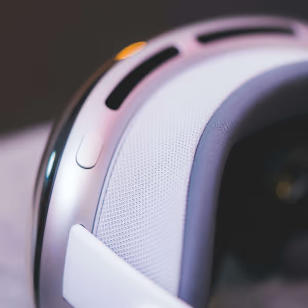
The biggest difference for VisionOS is the interaction. On a hardware level, that means you get a “top button” and a digital crown (the twisty wheel thingy), similar to the Apple Watch. In the Vision Pro software, you use a combination of hand and eye gestures. You select items by looking at them. For any new user, this takes some time to get used to, but if you have a visual impairment even more so.
Roel mostly uses shortcuts on his laptop and rarely relies just on his vision to do the tasks he wants to do. The Vision Pro also offers some shortcuts but with so few hardware buttons, it takes a while to memorise the most important ones. Want to recenter your view? Long press the digital crown. Want to quickly do the eye set-up? Press the top button four times, or quadruple-click as Apple calls it. You can also access the accessibility settings directly by a mere triple-click.
Simplicity in the way of user experience?
The eye and hand setup process helps you calibrate the device and simultaneously teaches you how to use it. You see a circle of dots and need to select them one by one. But, you have to do it 3 times and each time the background gets brighter. By the third time, the image was too bright for Roel so he needed to squint his eyes. Suddenly, the set-up was completed and we got an “Eye set-up unsuccessful” without any further explanation. Apple products are known for their brevity, often to the point it hurts the user experience when things don’t “just work”.
The solution here was to first set up the accessibility settings. Similarly to iOS, visionOS has the option to reduce the white point, a setting that reduces the intensity of bright colours.

Pass through, see better
Once the device was set up properly, the rest went a lot smoother. An often-heard complaint concerns the low quality of the passthrough video, which Apple calls Immersion. Since the Vision Pro is fully opaque, you are seeing the world around you through a live camera feed shown on the Vision Pro’s tiny displays. The feed does have some noticeable motion blur and reduced colour. For Roel however, having already reduced vision, this was barely noticeable and thus far less of an issue.
With the white point reduced, Roel could actually see better in a certain way. The live signal processing could automatically optimise what he saw, instead of having to constantly wear coloured lenses and put heavy tinted sunglasses on and off depending on the surrounding light. This type of augmented reality could be very promising for many types of visual impairments.
One step forward, two steps back?
The physics: price and weight
So what does the future hold for spatial computing in terms of accessibility? Is this it? Is the Vision Pro a blessing for accessibility? Unfortunately not – for now. We’ll look back at it as an important step forward and a true feat of engineering but not one to leave a lasting impression. For that, there are still some pieces of the puzzle missing. First of all the price needs to come down. At €4.000, this device is simply not affordable to most.
Second is the form factor. Anyone who tries on the Vision Pro for the first time is shocked by the weight. The premium materials as well as all the hardware required (cameras, screens, sensors) make this a very heavy device. Too heavy to be comfortable for anything more than 15 minutes.
Looking ahead, Roel envisions a future with a sleeker form factor, perhaps resembling stylish eyeglasses or contact lenses. This augmented reality could transform mobility, with features like large arrows guiding him to destinations and floating speech bubbles identifying people calling out to him. Shopping for clothes could also become more accessible, with the Vision Pro identifying colours and matching outfits.
Room for (AI) improvement
Another important element will be the integration of performant multi-modal AI models, some of which are already in the works. For those with severe visual impairments, this will be a necessity. The combination with spatial audio holds many promises. If an AI can interpret what’s happening around you and explain it to you, this could bring independence to many people who currently require another pair of eyes for many tasks. Experimental AI products like Humane’s AI pin and the rabbit r1 make it painfully obvious the tech is simply not there yet to do this well. But, at the pace of development in AI, we can expect this to come sooner rather than later. Simpler products like Ray-Ban’s smart glasses do seem to be on the right track of augmenting your everyday life with the power of AI.
A last element would be to streamline importing your accessibility preferences and sharing them across devices. Within the Apple ecosystem, this should simply be possible out of the box. After having set up everything on your iPhone or MacBook, you should be offered the option to take over these settings on your iPad and Vision Pro too. Even better would be a device-agnostic system that encodes your preferences in a QR code which you can scan on any new device. In terms of standardisation, this would be a big step forward.
Ideate, experiment, repeat
Before you label us as grumpy old men, we want to end on a positive note: our guinea pig Roel had a lot of fun trying out this device and so did we. Spatial computing or mixed reality is here to stay, and the Vision Pro gives us a glimpse of what the future holds. Even though there’s still a long way to go, now is the time to ideate and experiment. We need to learn what works well and what doesn’t, to be ready for when these devices go mainstream. In a future blog post we’ll explain which experiments we’re currently cooking up!
The journey of Apple Vision Pro and accessibility is just beginning. With continuous advancements and community feedback, the future holds immense promise for inclusive and empowering technology.
Experience the Apple Vision Pro at In The Pocket
Join us on May 30th at In The Pocket Ghent for a deep dive into the potential of the Apple Vision Pro.

Stay ahead
of the game.
Sign up for our monthly newsletter and stay updated on trends, events and inspiring cases.


.avif)

