- Start with a diverse user testing group. They will surprise you
- Consider inclusivity as a priority and qualitative attribute from the start. It will save you time
- Turn your thinking around & actively ask yourself: “who are we excluding if we implement a feature in this way?”
- Struggling with a non-accessible product? The most important step is to start. Look for an improvement you can start working on today & grow your efforts from there
Lessons in Accessibility from the White House Website

Imagine this: you have 6 weeks to launch a fully-operating website that will attract millions of viewers from the start. The legacy contractor isn't really
co-operating until 2 weeks before the launch date. Sounds like you're in dire straits, right?
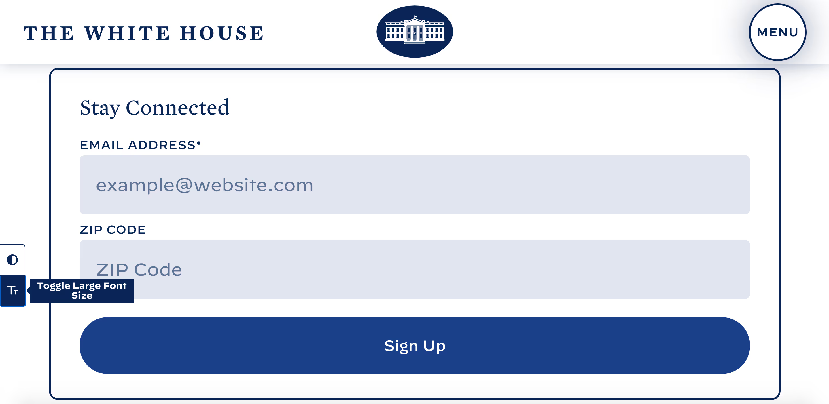
Fast forward to two weeks later. Despite the tight spot you were in, you've managed to launch an appealing first version on time. But what's even better? You've implemented new branding, a clear navigational structure, lots of whitespace, a high contrast mode and an enlarged font option.

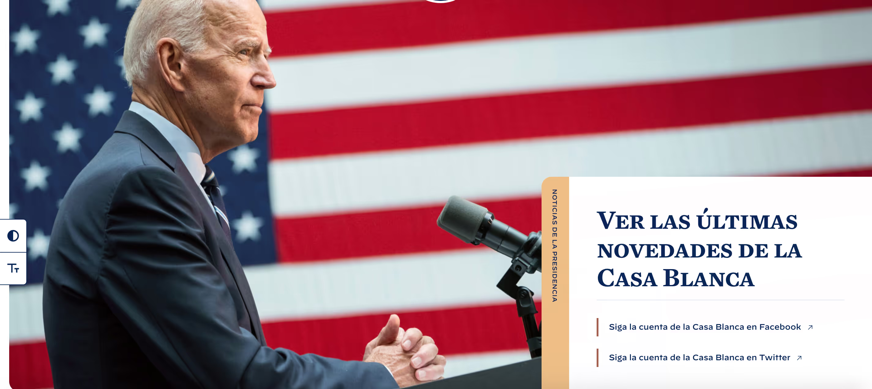
Sounds like a fantasy? Well, it happened. On Wednesday, January 20th, while president Biden was being inaugurated, the new White House website didn't just launch but also turned out to be a leading example of digital inclusivity. They succeeded in opening up their website to everyone, independent of gender, race, age, ability, background or context.
At In The Pocket, we believe that best-in-class digital products demand attention to inclusivity. Giving a warm welcome to all kinds of users isn't an asset, it's a must. Looking at Washington, we'd like to share how you can push for more digital diversity. Even when deadlines are looming.
Inclusivity as a prior parameter
Early digital inclusion is mostly a result of straight priority setting. From the first brainstorm, mapping inclusivity and accessibility as a clear driver for success is essential. But how come this nut is still a hard one to crack for a lot of us?
First off, the drivers for inclusiveness of a digital product mostly don't show up into the traditional parameters. We make use of target groups, time and again consisting of 20 to 35-year-old urbanites, and we narrow down our gaze to servicing this innovation-prone group.
We need to be aware that innovative ideas and thinking forward can come from a lot of different groups, not just the young, able-bodied and digitally skilled. As humans, we are masters at working around obstacles and coming up with new solutions.
For example, people with learning disabilities that struggle to make sense of large quantities of information might be masters in coming up with innovative ways of revamping your information structure.

To change the overall mindset and help broaden our horizons, we can simply ask ourselves: “Who are we excluding from our experience when we implement a feature in this way?”. By asking this question from day one, we become actively aware of whose needs we are prioritising and whose we are ignoring.
By default, we would think that providing an English version would be enough for all US citizens. The White House team, however, chose to prioritise the needs of the 50 million Spanish-speaking citizens and provide a Spanish language option from the first launch. A smart move since the USA has the second-largest Spanish speaking population in the world and this group will only continue to grow over the coming years. This feature wasn’t added by the previous administration at all.
The accessibility statement
The White House website also included an accessibility statement page where they commit to working towards the WCAG 2.1 level AA guidelines. Accessibility statements are required by law both in the USA and in Europe for government websites. Even though it is one of the legal boxes to tick, we shouldn't forget why this is so important. It states publicly that you as a company, public or private, care about accessibility and your users.
This statement encourages visitors to reach out with feedback regarding certain problem areas. Whether you’re a private or public website, it's an opportunity to solidify your commitment and make sure it remains an important driver for your digital product in the future.

Start early, profit later
But what if you pushed ‘the inclusivity challenge’ to the back of your roadmap over and over again? More often than not, you will discover that adding these specific features to an ill-fitting product foundation requires more time and effort than expected, leading to a difficult rollout and an aversion to building on inclusivity.
Don’t despair, there are ways out of this bad mojo. The most important rule is to start today. Invite a diverse group of users for a testing session, spot the issues they struggle most with, look with the team to what you can start changing today and work your way up from there, guided by the right priorities. It’s better to start out small and work your way up than to never start at all.
Do you find yourself at the start of your product’s lifecycle? Make the right move and prioritise inclusivity from the start. It will save time and effort in the long run and help you build up a great relationship with all your users from day one. Plus, it benefits you as well. Being inclusive increases your potential user base significantly and therefore also your potential revenue or market share. Create a competitive advantage, right from the start.

Make the difference
Designing a premium digital product has always been a moving target and
no one will deny that reaching that inclusivity goal is hard. But we sure believe it is a goal worth striving for. Taking it seriously from the start might be your key differentiator in the future.
Think about it. The choice for accessibility and inclusivity immediately underlines the change of style between the two administrations. It’s a differentiator between the old and new presidency. Don’t think that making your website more inclusive is just ‘the right thing to do’, it’s more than that. It’s about what you stand for as a company.
Interested in broadening your views? Listen to our Studio Shift interview on inclusivity.
Never miss an update
Get the latest of our software & technology insights to your inbox!

Stay ahead
of the game.
Sign up for our monthly newsletter and stay updated on trends, events and inspiring cases.
.avif)


