Wayfinding with augmented reality
Thanks to its unique properties, AR has the potential to change the way we interact with buildings. Wayfinding is one of AR's many practical features that needs exploration. In partnership with VLAIO, we had the chance to design and test some of our wayfinding assumptions in the buildings of VRT. And we learned a lot along the way.

In short
- Challenge: Showing the way with augmented reality.
- Solution: Building 6 possible AR wayfinding solutions.
- Approach: Discovering the do’s and don'ts of different possibilities.
- Outcome: Delivering a proof of concept and gaining priceless insights.
The Challenge
The buildings of VRT are quite the maze. With the help of AR Wayfinding, we could make it easy for visitors to effortlessly navigate their hallways and end up at the right door. Apart from finding a wayfinding solution, building this product was more about learning valuable lessons and best practices for the future.
AR is still a young technology, so it's impossible to rely on common best practices. Uncharted domains are where we thrive best. We came to the agreement that our design team would explore 6 experiments, after which the development would take over to build the demo for HoloLens 2. The end goal? A working proof of concept that serves as a base to build wayfinding solutions anywhere.
The Solution
There are a ton of ways to show the user the way from A to B through a HoloLens 2, each one with its own perks and drawbacks. Inspired by racing and adventure games, the team came up with a list of ideas worth exploring. An intense collaboration between designers and developers resulted in a demo of different ways of AR wayfinding.
Eventually, we ended up with a proof of concept that entails six different wayfinding solutions. As a bonus, the demo is now fully functional for our offices and the buildings of VRT. But more importantly, we uncovered some priceless AR wayfinding best practices which we gladly
share with you.
The Approach
Field of view matters
For the very first wayfinding solution, we introduced several gates in our virtual world. On the UX side, this seemed a valid idea as it feels natural to walk from one gate to another. In reality, we stumbled upon some issues that taught us a valuable lesson.
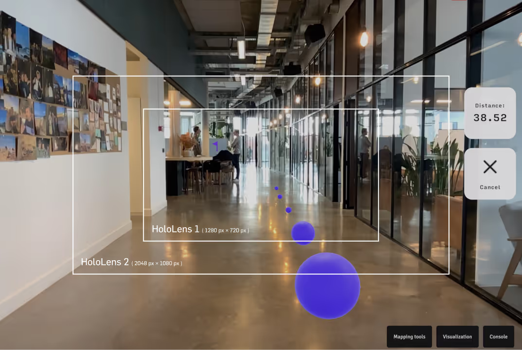
Firstly, the gates were difficult to render due to their big size and didn’t fit in small parts of the building. Secondly, the field of view through the HoloLens 2 is quite small. It would often happen that a user would pass a certain gate without noticing or simply get lost as soon as the gate was out of the field of view. We took note: the impact of the HoloLens 2’s limited field of view, while larger than HoloLens 1, should not be underestimated.
User height matters
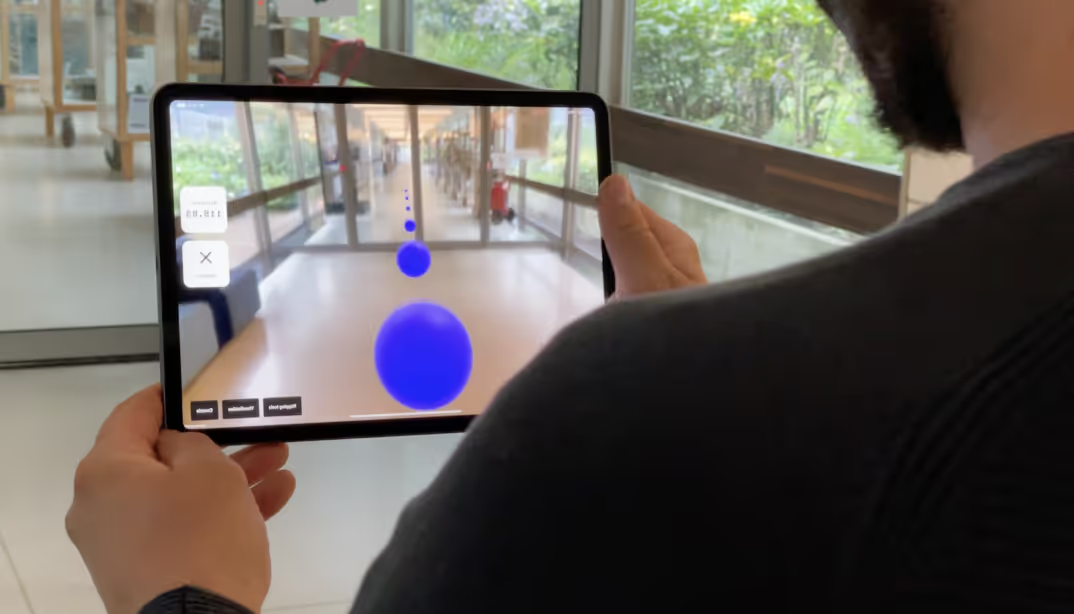
Next up, we tried virtual pathways on the floor. Just like Pac-Man, the user would need to ‘eat’ the dots presented in front of him. At first we placed the dots on a height of 1,5 meters from the floor, but not every user is the same height. So we changed the guidelines to show the balls based on the HoloLens 2 position, ensuring that the balls always are in the field of view while remaining at a comfortable position for any user.
Spatial Audio
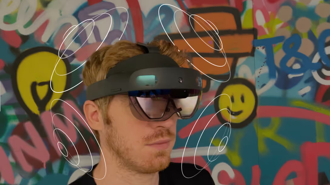
Wayfinding can be playful too. We created a digital paper plane that guides the user to its destination. It’s a more interactive and fun way, but when you lose track of the paper plane it can be hard to retrieve it. To not clutter the field of view with more dots or arrows, the most interesting solution was using sound. The HoloLens 2 proved to have excellent spatial sound capabilities that were useful to guide the user back to the paper plane.
Progressive disclosure in AR
Progressive disclosure is big in UX. It’s the idea that you want the user to only see relevant information at any given time. Otherwise, you end up overloading the user with information and downgrade the experience. The idea is valid in AR as well. So instead of showing the gates or dots all at the same time, we always made sure that these elements only appeared when necessary.
Fixed vs. floating
As for UI in AR, you have two concepts: fixed and floating. This translates to two different interfaces. Hand menus, where a floating pop-up menu is controlled by hand gestures, and belt menus, which virtually attach to an object in the virtual space. Floating menus have some accessibility issues, while fixed menus kind of defeat the purpose of AR.
We ended up with a combination of the hand menu and belt menu. The hand menu for scoring some style points, and the belt menu to make the experience user-friendly. We suggested having the menu in front of users at all times, so that they’d have to complete the action before continuing the task at hand.
The Outcome
With the support of VLAIO, the help of VRT and the splendid effort of the team, we managed to deliver a functional demo that includes six wayfinding solutions. We know, however, that it was not so much about the destination, but about the journey. With our experiments, we ended up with a mini-bible full of priceless best-practices and valuable
insights for building AR wayfinding solutions
Curious what augmented reality can do for you?
Find out now!
.jpg)
.jpg)